CATEGORY:
Mobile Application
CLIENT:
General Assembly
YEAR:
2025
DURATION:
2 Weeks

about.
Over 40% of insurance customers are unfamiliar with the details of their own policies, a gap that frequently leads to unexpected claim denials and eroded trust in insurers. This statistic grounded the challenge I set out to explore in this project.
Prudential is one of the largest insurance providers globally, serving over 18 million customers across Asia and Africa. In Singapore, Prudential Assurance Company Singapore serves over 1 million customers with life and health insurance, alongside wealth management solutions.
As part of my UX design bootcamp, I independently owned the end-to-end design of a mobile application feature, a personal coverage calculator, to help existing policyholders quickly understand what they are covered for and make informed decisions about their insurance portfolio.

challenge.
My main criteria are to have basic coverage so that if anything happens to me, my loved ones won’t suffer.
This quote, drawn from my research, captures what insurance ultimately means to people - not premiums or policy numbers, but peace of mind. Yet the products meant to protect them rarely make them feel protected.
Two core design challenges shaped this project:
Primary - How might we help users quickly access and understand the essence of their coverage details, without sifting through complex policy documents?
Secondary - How might we enable users to identify gaps in their portfolio and take informed action to address them?
insights.
I conducted five semi-structured virtual interviews, each 30 minutes long, with insurance policyholders aged 30 - 40 who had experience using an insurance mobile app. Interviews continued until clear themes emerged across participants.
Three key insights shaped the design direction:
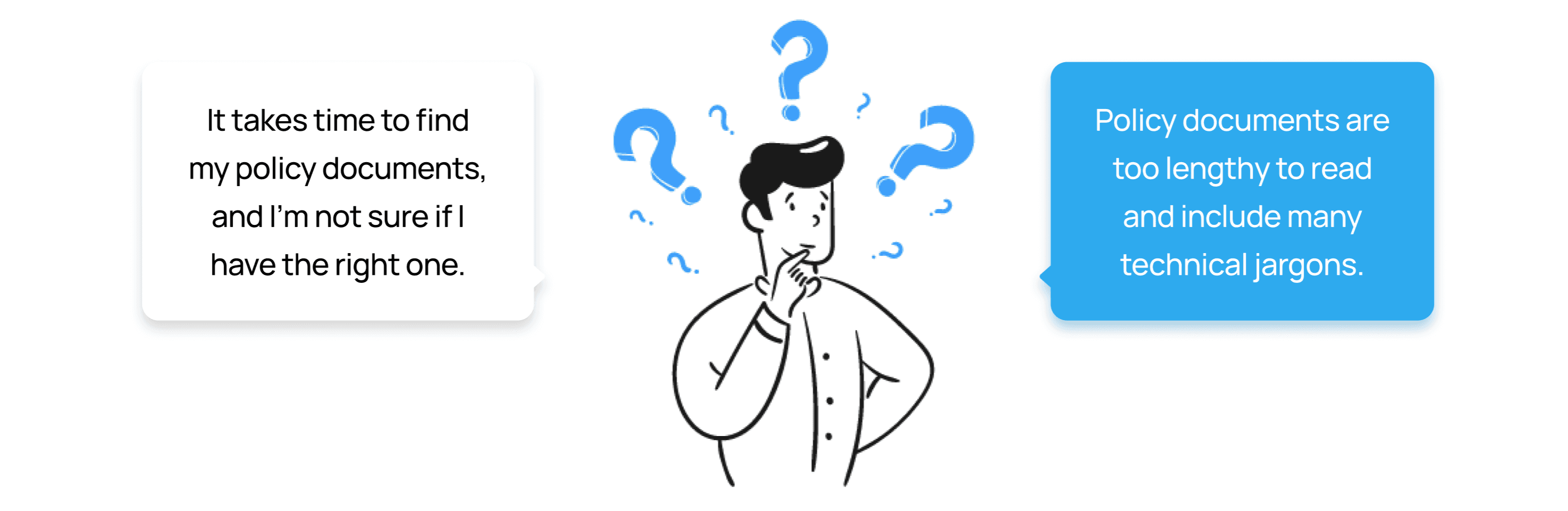
1. Poor Accessibility to Information
Policy documents are hard to find and even harder to understand. Users are left navigating complex, lengthy technical jargon just to answer a basic question: what am I actually covered for?
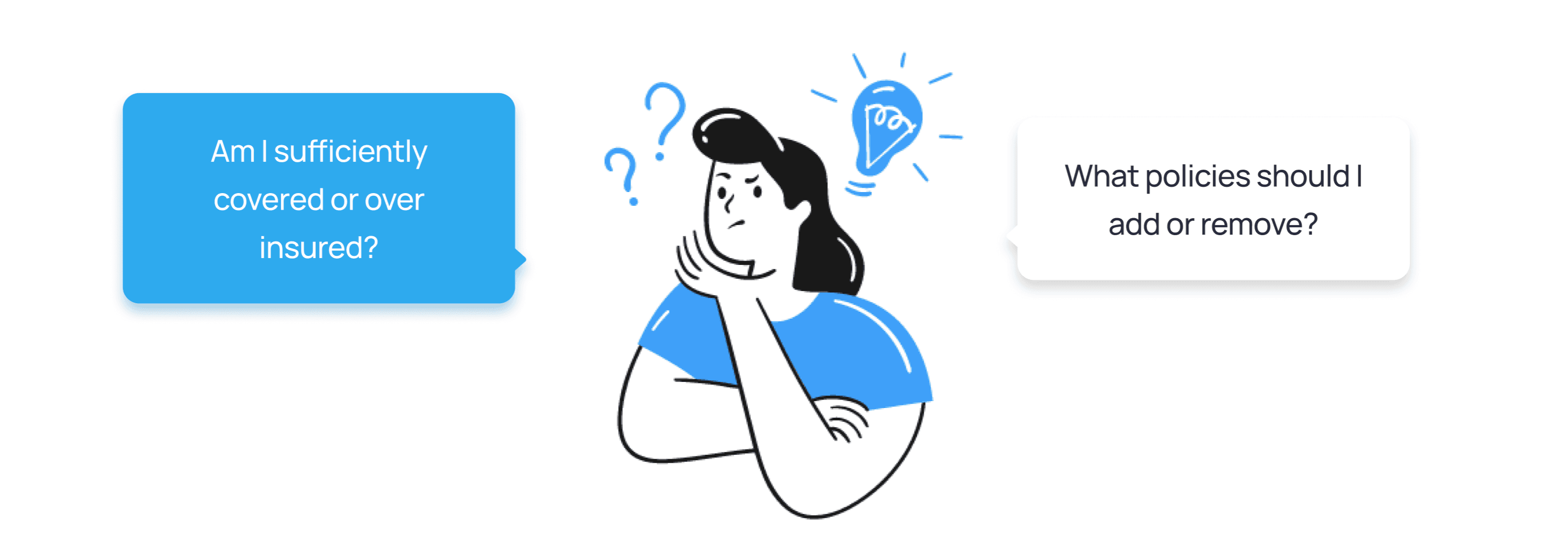
Lack of Portfolio Analysis and Recommendations
Without a clear view of their total coverage, users can't tell if they're protected, over-protected, or exposed. Rather than confidence, their insurance portfolio produces anxiety.
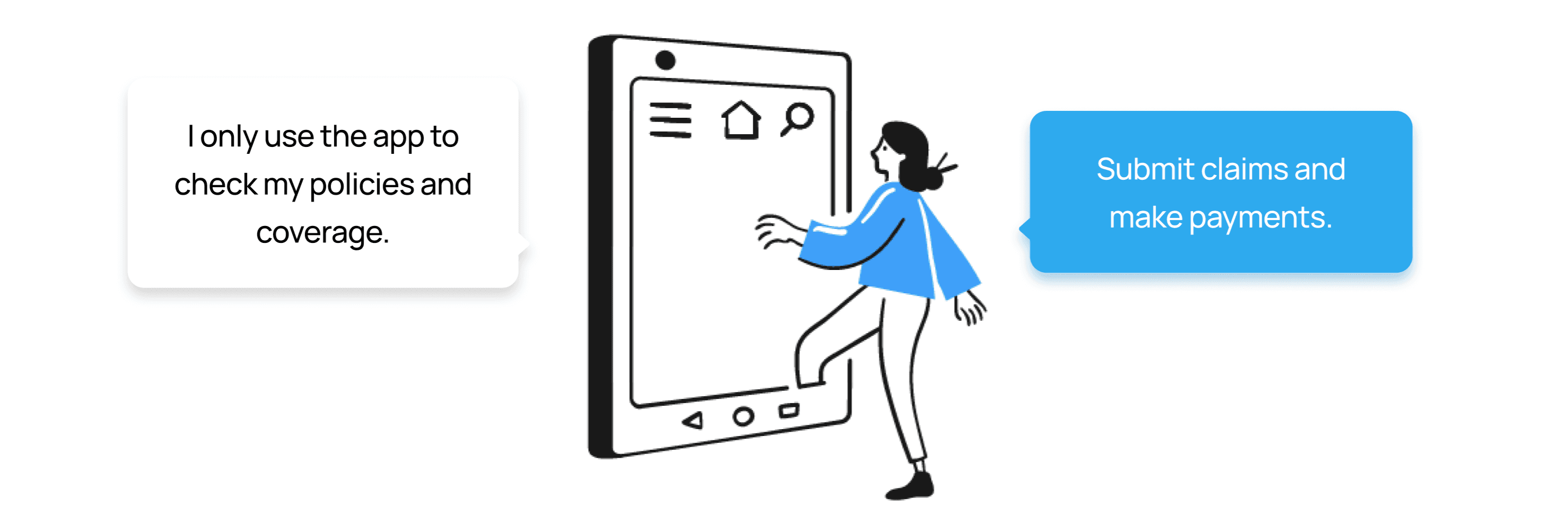
Varied Usage of App
Users treat the app as a transactional tool. They log in to complete a task and leave, because nothing gives them a reason to stay or explore. This told me that any new feature needed to offer genuine, proactive value, not just another transaction.
solution.
Insights #1 and #2 pointed clearly toward the same underlying need: users want to understand what they have, and whether it's enough, without having to decode a document to find out.
The coverage calculator was the design response to that need. The calculator metaphor was deliberate. Unlike a dashboard, which displays information passively, a calculator implies agency - the user inputs their situation and gets a personalised answer. This framing shifts the experience from "here is your policy" to "here is what your policy means for you."
The feature allows users to:
Select a hypothetical medical condition and hospitalisation type to generate an estimated coverage amount.
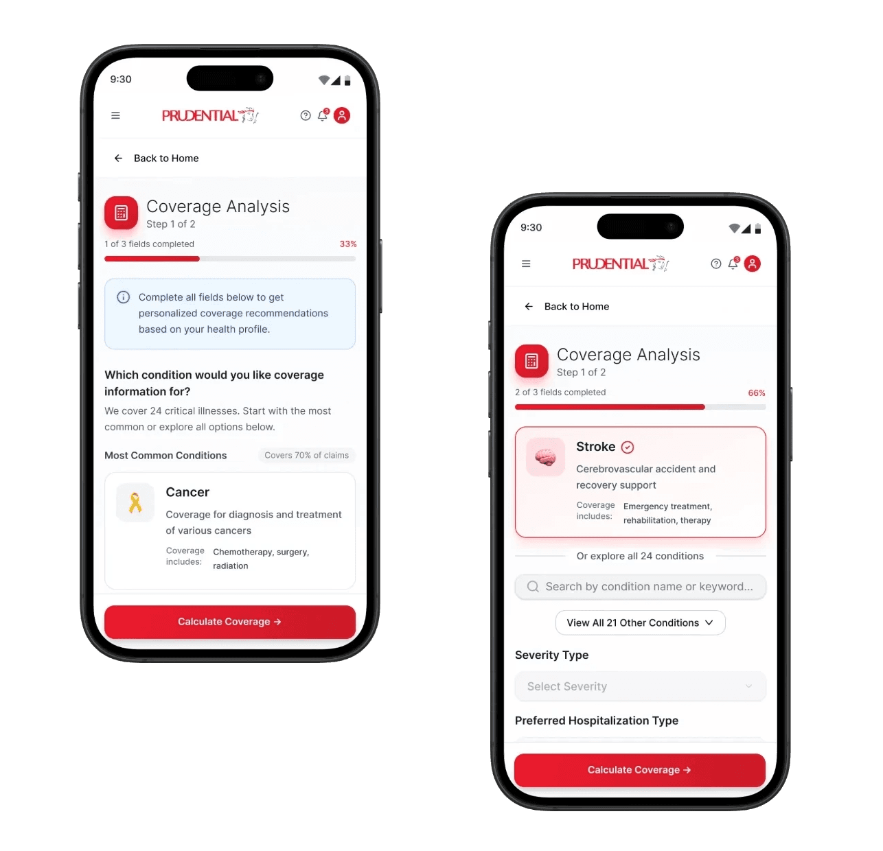
View a clear breakdown of what is covered versus what they would pay out of pocket.
Identify gaps in their current coverage and explore options to top up or upgrade their plan.
result.
I conducted usability testing with 5 participants using an interactive prototype, observing how they navigated the coverage calculator end to end.
The fixed estimate felt impersonal
It would be nice if I could input my own amount to calculate coverage, making it more personalized for me.
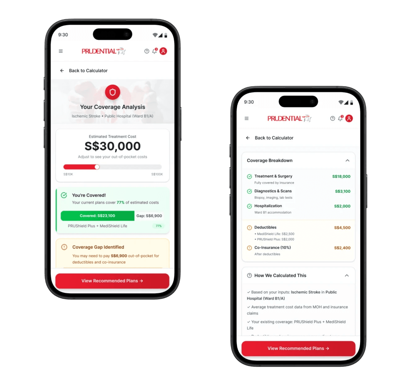
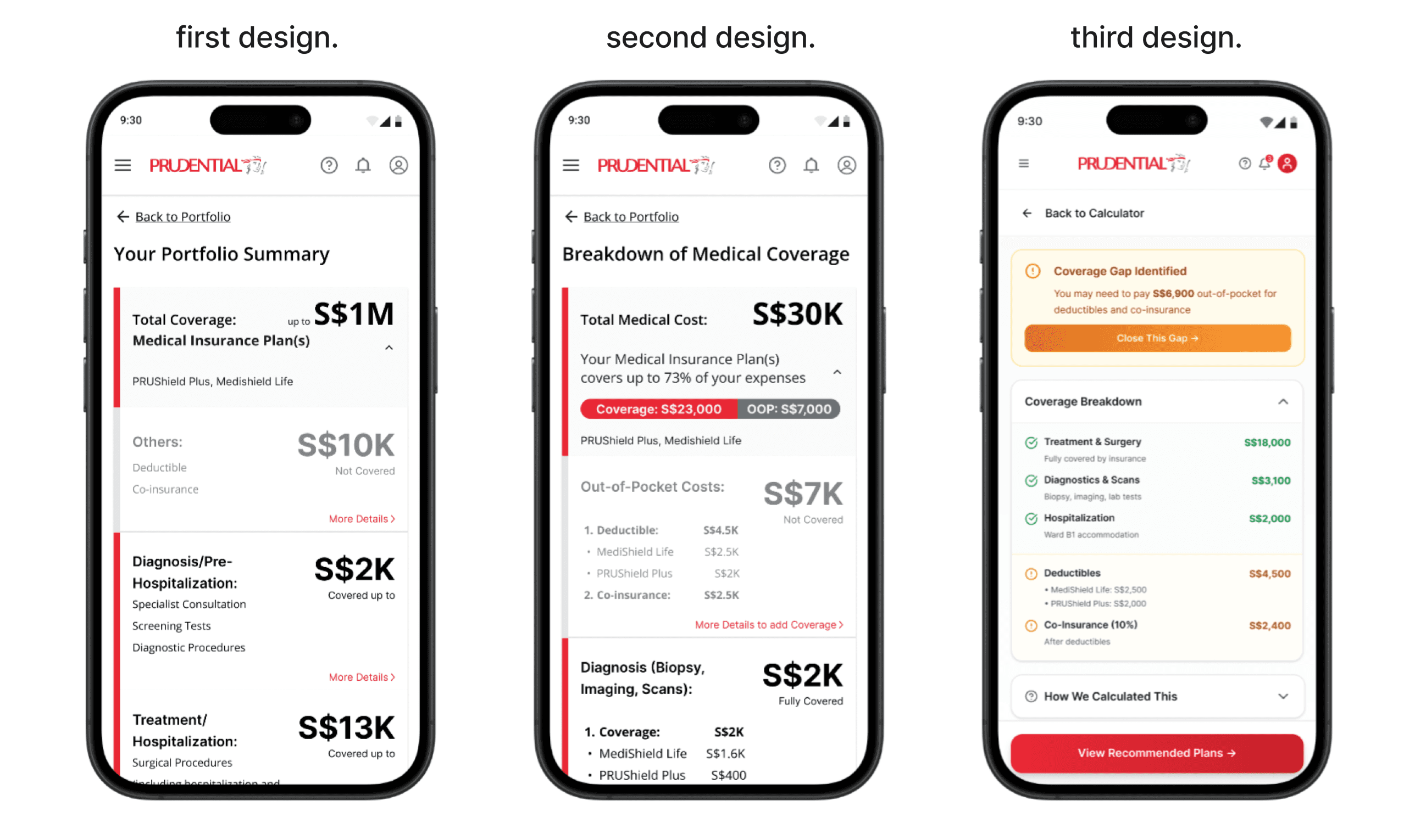
V1 generated a fixed medical cost estimate based on the user's selected condition and hospitalisation type, with no way to adjust it. Users found the figure too generic to feel relevant to their situation.
V2 introduced a free-input text field, letting users override the estimate directly and make the calculation their own.
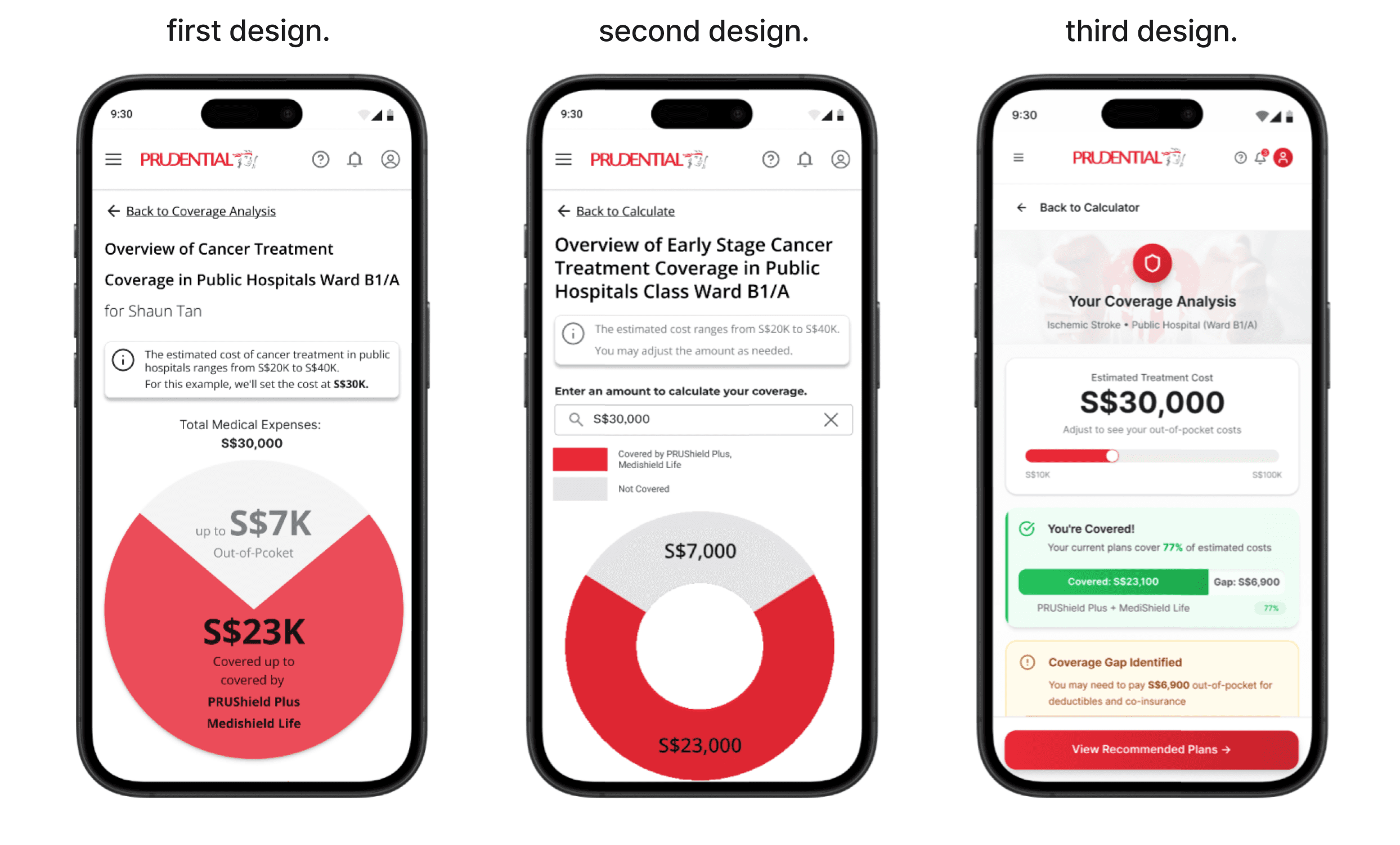
The summary didn't answer the question users actually came to ask
After viewing the coverage overview, users landed on a portfolio summary screen in V1. The information was accurate, but it answered the wrong question. Users had just asked "if I get ischemic stroke, what happens?". They wanted a breakdown of exactly what was covered and what they'd pay out of pocket, not a summary of their total portfolio.
V2 replaced the portfolio summary with a dedicated "Breakdown of Medical Coverage" screen, surfacing the covered amount (S$23K) and out-of-pocket cost (S$7K) upfront, with a per-category breakdown beneath.
V3 made the breakdown more scannable, covered and uncovered items separated visually with clear category labels. A "Coverage Gap Identified" callout highlighted the most actionable information first, while a "How We Calculated This" accordion let users delve into the logic without cluttering the main view.
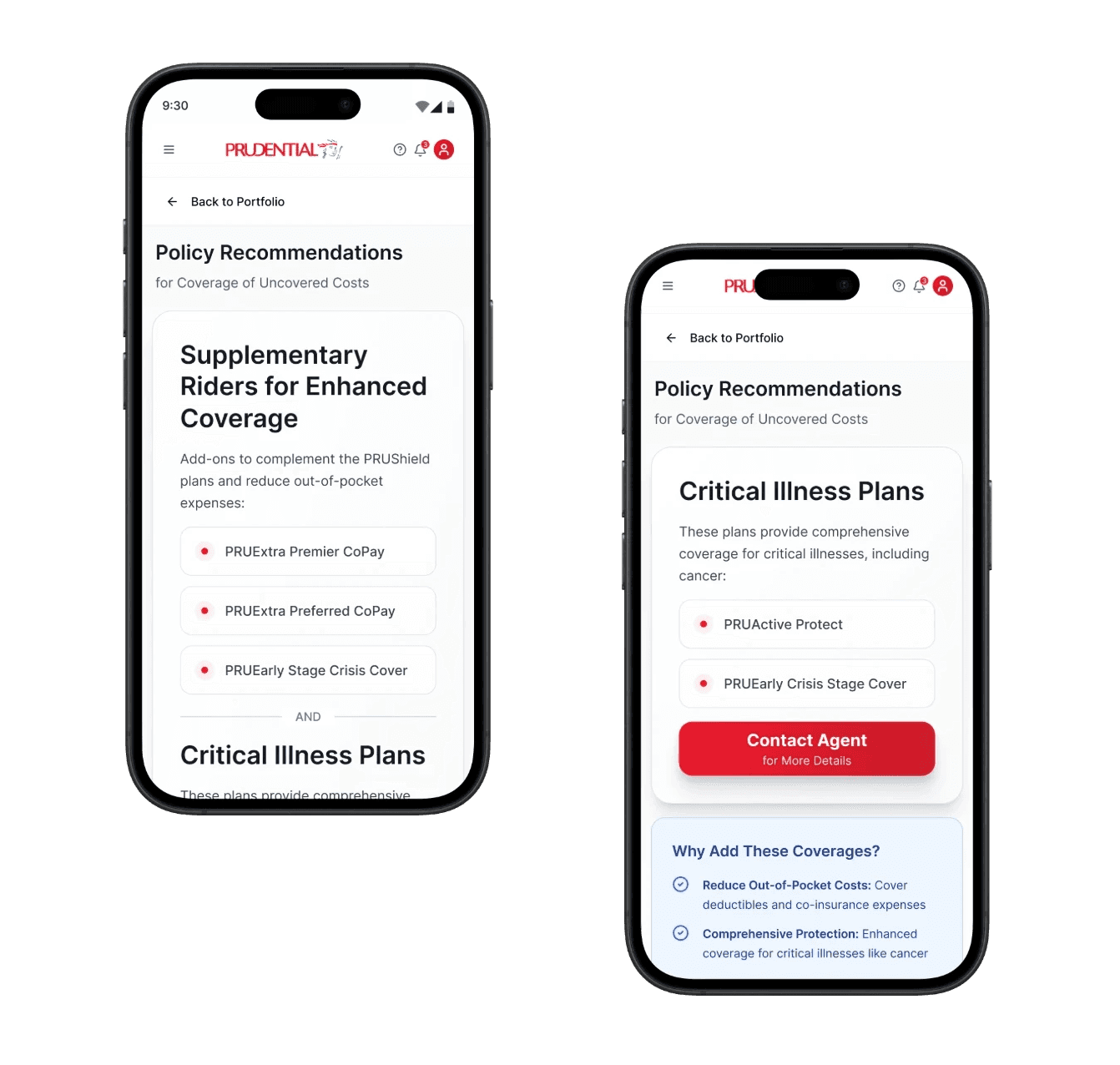
40% of users couldn't find the recommendations page, and the rest struggled to get there
Two out of five users couldn't locate the policy recommendation page at all. The remaining three found it eventually, but took more than five minutes each as the navigation was unclear.
The root cause was twofold: the link label "More Details" gave no indication of what lay beyond it, and the greyed-out card didn't read as interactive.
The fix was progressive, relabelling the link to "More details on coverage", then replacing the card entirely with a prominent callout box highlighting the coverage gap and a "Close This Gap" button.
takeaways.
This project reinforced something I hadn't fully appreciated before: information architecture is not just about structure, it's about trust.
In insurance, users are already navigating anxiety about risk, money, and the future. When information is hard to find or harder to interpret, that anxiety compounds. Every IA decision in this project such as what to show first, how to label an action, how to break down a number, was ultimately about giving users enough clarity to feel in control.
The most unexpected learning was about engagement. Users weren't avoiding the Prudential app because it was difficult to use, they simply had no reason to open it between transactions. This reframed how I think about feature design in low-frequency, high-stakes products: the goal isn't just to make tasks easier, it's to create moments of value that earn a place in someone's routine. The coverage calculator was a step in that direction, inviting users to engage with their portfolio proactively, rather than waiting for something to go wrong.